Insights
Turning Project Data into Better Decisions
Learn how powerful reports and dashboards improve construction project management. Discover how ProjectTeam.com’s no-code customization helps teams...
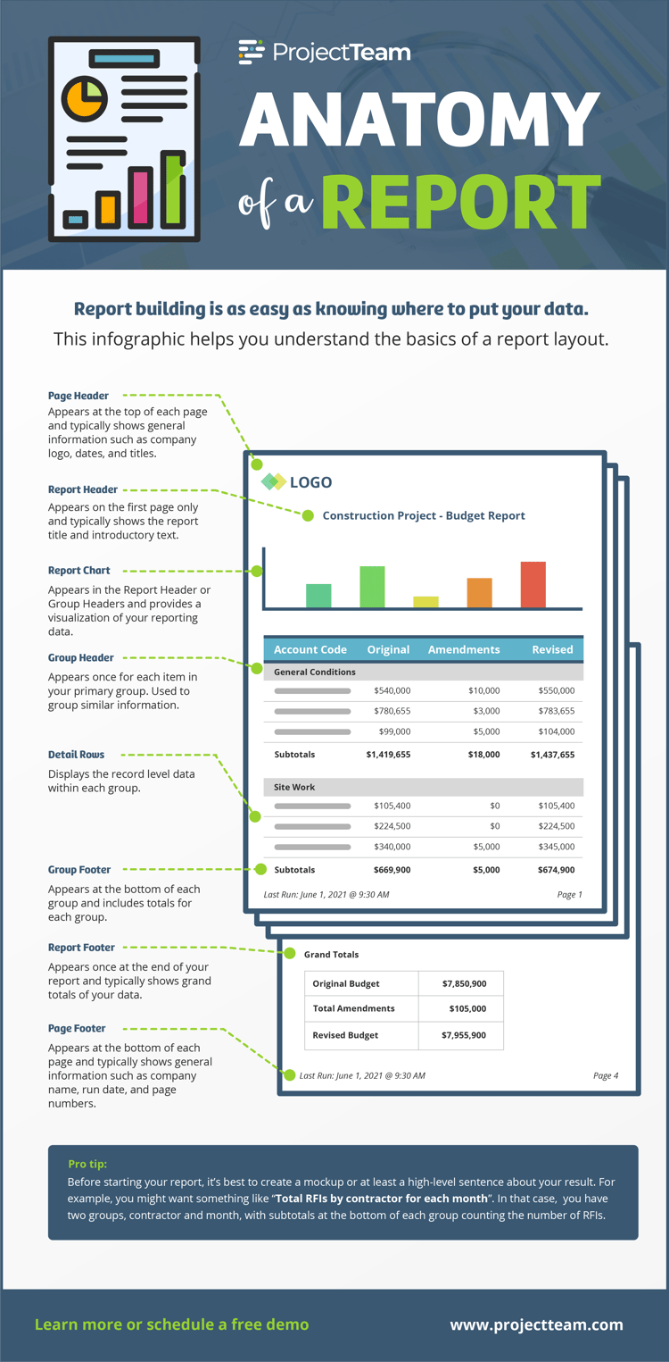
For a lot of people, reporting can be an intimidating term. However, creating a useful report is as easy as understanding where to put your data.

For a lot of people, reporting can be an intimidating term. However, creating a useful report is as easy as understanding where to put your data. Download the diagram below for an overview of groups, headers, footers, and how to use them. To learn more about creating reports and dashboards in ProjectTeam, schedule a 30-minute product tour.
Learn how powerful reports and dashboards improve construction project management. Discover how ProjectTeam.com’s no-code customization helps teams...
ProjectTeam.com gives renewable energy contractors the flexibility to track unique processes like tax credit compliance, interconnection milestones,...
When your team is required to use an owner-specified system, you don’t have to accept its limitations. ProjectTeam.com is often used alongside these...